


Many businesses mistakenly equate a brand identity with a standalone logo mark. In reality, a logo is merely a singular signature point. True market authority is commanded through a holistic visual identity system—a synchronized framework of color theory, typography hierarchy, UI design tokens, and tone of voice.
When an enterprise brand presents inconsistent visuals across digital touchpoints, it sends subtle signals of unreliability to prospective high-value clients. A unified design system ensures that every ad creative, landing page component, and sales asset reflects premium polish and builds instant market trust.
"A logo is just a signature; a complete visual identity system creates an inescapable feeling of premium authority and trust."
Fragmented Graphic Design vs. Unified Visual Systems
The strategic comparison below contrasts disjointed graphic assets against Global VA's systematic brand identity engineering:
| Brand Dimension | Fragmented Graphic Assets | Unified Visual Identity System |
|---|---|---|
| Design Foundation | Random ad-hoc templates & stock graphics | Centralized Figma design tokens & UI libraries |
| Color Architecture | Inconsistent hex codes across platforms | Strict primary, secondary & dark-mode accents |
| Typography Scale | Arbitrary font picks per project | Harmonic font pairing & responsive scaling rules |
| Perceived Value | Commoditized, low-tier provider feel | Premium industry leadership & high pricing power |
Pillar 1: Color Theory & UI Component Design Tokens
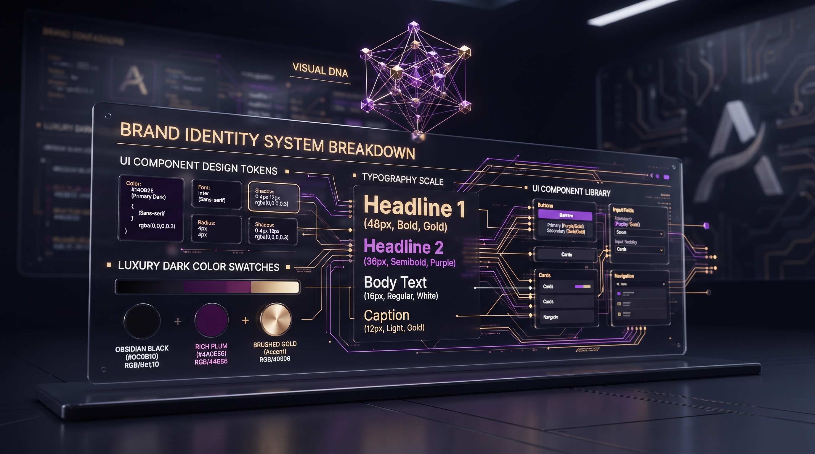
A sophisticated dark/luxury color palette (such as deep charcoal bases paired with soft purple and cyan accents) triggers powerful subconscious psychological responses. By defining strict design tokens—variables for background fills, border opacity, and button states—brands achieve flawless visual consistency regardless of platform.
This systematic component structure enables design and development teams to ship new campaign pages rapidly without diluting core brand aesthetics.
Pillar 2: Typography Scale & Visual Hierarchy
Typography communicates your brand's voice before a single word is read. Pairing a high-contrast heading typeface (`Poppins`) with a clean, readable body font (`Inter`) creates clear visual hierarchy, guiding the user's eye effortlessly toward key value propositions and conversion CTAs.
Pillar 3: Tone of Voice & Conversational Trust
Visual identity extends directly into copy. Defining a clear brand voice—authoritative yet approachable, concise, and focused on outcomes—ensures your message resonates strongly across website copy, social media channels, and client communications.
4-Step Engineering Action Plan for Brand Elevation
- Brand System Audit: Identify visual inconsistencies across all existing web pages, ad sets, and pitch decks.
- Design Token Definition: Standardize color hex codes, font scale ratios, and component spacing variables.
- UI Kit Creation: Build a master Figma UI kit containing reusable dark-mode buttons, cards, and navigation elements.
- Brand Voice Guidelines: Document tone rules to maintain authoritative storytelling across all public content.
Conclusion: Command Premium Pricing Through Visual Authority
Investing in a systematic visual identity is not an aesthetic luxury; it is a core business catalyst. Brands that project structural authority naturally attract higher-tier clientele and command premium market positioning.